Stylescapes vs. Moodboards
I was recently introduced to the idea of a stylescape. My initial reaction was: “Isn’t that just going to take more time than a moodboard? What’s the point?”
Since then, I’ve tried stylescapes with three different branding projects. Although they’re more work up front, stylescapes end up saving you WAY more time in the long run, because they give the client a super clear idea of where their branding is going.
You might know what a moodboard is but… what the heckedy-who is a stylescape?
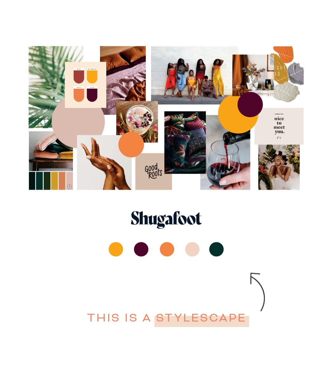
A stylescape is a large collection of images for inspiration purposes. It also often includes a corresponding color palette and typeface, serving as the creative direction for a branding design project.
But what is all that stuff? What does it look like?
This was something I had been struggling with— many clients loved their moodboards but then the first brand concept would get rejected. Turns out, the moodboard wasn’t doing a good enough job of conveying the creative direction I had in mind.
Since making the switch, I’ve had little to no revisions (us designers love hearing those sweet words 😏) on my brand concepts. I’m always looking for ways to improve my process, and stylescapes are definitely going to be here to stay.
The verdict is in: stylescapes are the winner!


